Principle Component Analysis
In the previous posts of this series, I covered methods to determine the optimal number of clusters, how k-means , k-medoids, hierarchical, density based clustering algorithms, and cluster validation in detail. In this seventh post of the Unsupervised Learning in R series, I will try to explain principle component analysis.
Principal component analysis (PCA) is a technique used to identify patterns in a dataset. It does this by identifying the directions (or "components") in the data that account for the most variation. The first component is the direction in the data that accounts for the most variation, the second component is the direction in the data that accounts for the second most variation, and so on. [1], [2]
Principal component analysis is especially useful in large datasets or datasets with many variables. Thanks to analysis, complex relationships in the data set can be clarified using fewer variables. This ensures that the data set can be interpreted more easily and less erroneous results are obtained by using fewer variables.
Applying PCA to the dataset before clustering has several advantages that can be listed as follows:
-
Since PCA can be used to reduce the number of features in a high-dimensional dataset, which can help improve the performance of a clustering algorithm, by reducing the dimensionality, PCA can also help to reduce noise and eliminate multicollinearity in the data, making it easier to interpret the results of a clustering analysis. [3]
-
PCA can be used to visualize high-dimensional datasets in two or three dimensions, making it easier to understand the structure of the data and identify clusters. This can be especially useful for large datasets with many features, as it is often difficult to visualize and interpret the results of a clustering analysis in high dimensions.
-
Clustering algorithms can be computationally expensive, especially for large datasets. By reducing the dimensionality of the data with PCA, the computational burden of the clustering algorithm can be significantly reduced, making it faster and more computationally efficient. [3]
-
PCA can help to enhance the performance of a clustering algorithm by transforming the data into a new coordinate system that better separates the underlying clusters. This can lead to more accurate and meaningful results, especially for datasets with complex structures. [4]
-
The fact that the correlation between the variable pairs in the data set is quite high may cause the cluster analysis to obtain incorrect results. This problem will disappear as the correlation between the components of the data set will decrease after PCA.
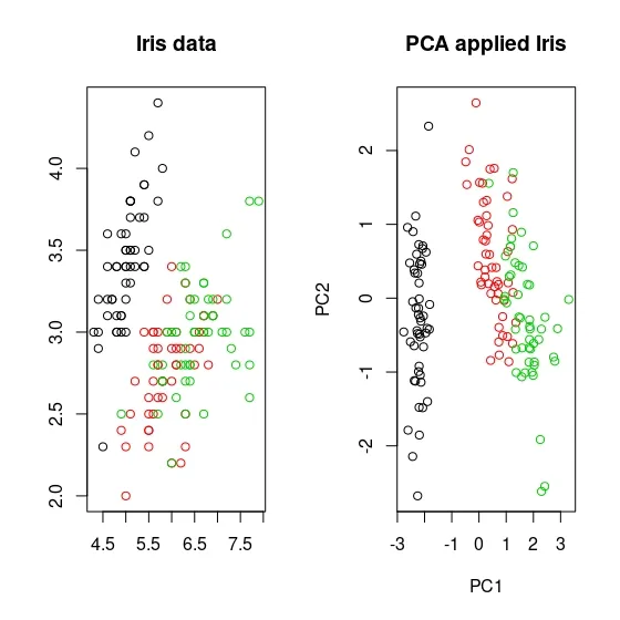
For example, if I take the famous Iris dataset, below you can see the scatterplot of the Iris dataset on the left and the PCA-applied Iris dataset with 2 principle components on the right. In the non-PCA-treated Iris dataset, you may notice that the two species, shown in green and red, are crossed. On the contrary, you can see that it is more separated in the PCA-applied dataset compared to the other, although not obviously.
Here is a step-by-step explanation of how PCA is calculated:
-
Data is transformed so that each variable has a mean of zero and a standard deviation of one. This is done to ensure that all variables are on the same scale.
-
Covariance matrix is calculated to determine the relationship between the variables in the dataset.
-
Eigenvectors and eigenvalues of the covariance matrix are calculated. Eigenvectors represent the directions in the data that account for the most variation, and eigenvalues represent the amount of variation that is accounted for by each eigenvector.
-
Eigenvectors with the highest eigenvalues are chosen as the principal components of the dataset.
-
The original dataset is transformed by projecting it onto the principal components, resulting in a new dataset with reduced dimensionality.
-
The principal components are interpreted in terms of the original variables to understand the underlying patterns in the data.
Principle Component Analysis in R
In this section, I will cover the implementation of PCA with R. Just as always, I will use the same dataset, Breast Cancer Wisconsin from the UCI Machine Learning Repository in the analysis.
Principle component analysis is done in stats package with the function called prcomp.
data.pca <- prcomp(df, # data set that PCA will be applied. scale. = TRUE # whether data will be standardized. ) summary(data.pca) # to see the results.
Importance of components: PC1 PC2 PC3 PC4 PC5 PC6 PC7 PC8 PC9 PC10 Standard deviation 2.3406 1.5870 0.93841 0.7064 0.61036 0.35234 0.28299 0.18679 0.10552 0.01680 Proportion of Variance 0.5479 0.2519 0.08806 0.0499 0.03725 0.01241 0.00801 0.00349 0.00111 0.00003 Cumulative Proportion 0.5479 0.7997 0.88779 0.9377 0.97495 0.98736 0.99537 0.99886 0.99997 1.00000
This output contains the results from principal component analysis. "standard deviation", "proportion of variance" and "cumulative proportion" values are displayed for each component.
Standard deviation is the square root of the variance for each component. This value indicates how well the component explains the variability in the data set. For example, the standard deviation of the PC1 component is 2.3406, indicating that PC1 explains most of the variability in the data set.
Proportion of Variance shows the share of each component in the total variance. For example, component PC1 explains 54.79% of the variance in the data set. The PC2 component explains 25.19% of the variance in the data set.
Cumulative Proportion shows the total share of each component in the variance. This value shows the share of all components up to that component in the total variance. For example, PC1 explains 54.79% of the total variance in the data set, but the first two components explain 79.97% of the variance in the data set.
The number of components can vary depending on the size of the data set and the purpose of the analysis. However, it is common to choose enough components to explain 70–80% of the cumulative variance of the components. In this example, it might be a good starting point for choosing two components, as the first two components explain 79.97% of the total variance. However, in each case the number of components may vary depending on the analyst's purpose of analysis and the characteristics of the data set.
Another way to decide the number of components is the scree plot. Scree plot is formed by plotting the percentage of explained variance for each dimension. Just like in the elbow method, an elbow is searched for in a scree plot. The component from which the elbow is formed is selected as the optimal number of components. fviz_eig function from factoextra package is draws scree plot.
library(factoextra) fviz_eig(data.pca)
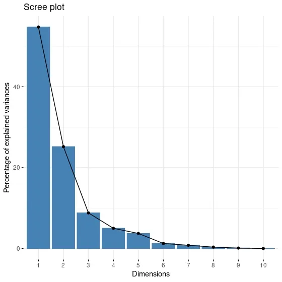
When the screen plot is examined, we notice that the elbow appears in the third component. It looks different from the conclusion I arrived at in this summary output. For this reason, I need to make a more detailed investigation.
data.pca object to which I assign the PCA result has many different properties. One of these features is the rotation property. The data.pca$rotation statement is used to access the "rotation" property on the "data.pca" object. The rotation property shows the relationship of components to the original variables. For example, component 3's rotation property is a vector showing the relationship between each of the original variables and component 3. This vector can help us understand the relationship of the original variables to the principal components. Since I am stuck between 2 and 3 components in this example, I will look at the rotation values of the first three components.
data.pca$rotation[,1:3]
PC1 PC2 PC3 radius -0.36393793 0.313929073 -0.12442759 texture -0.15445113 0.147180909 0.95105659 perimeter -0.37604434 0.284657885 -0.11408360 area -0.36408585 0.304841714 -0.12337786 smoothness -0.23248053 -0.401962324 -0.16653247 compactness -0.36444206 -0.266013147 0.05827786 concavity -0.39574849 -0.104285968 0.04114649 concave.points -0.41803840 -0.007183605 -0.06855383 symmetry -0.21523797 -0.368300910 0.03672364 fractal.dimension -0.07183744 -0.571767700 0.11358395
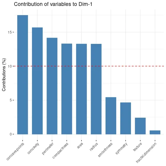
In the above output, each column contains a vector showing the principal component's relationship to the original variables. For example, the PC1 column is a vector showing the relationship of each original variable to PC1.
This relationship shows how much each original variable contributes to the principal components. For example, in the PC1 column, the negative contribution of the variables "radius", "perimeter" and "area" is higher. This indicates that these variants contribute more to the formation of the PC1 component.
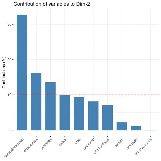
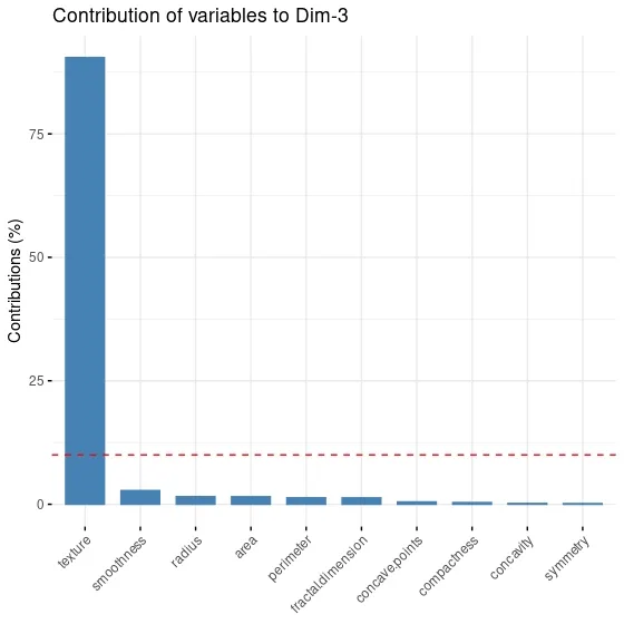
When I look at the PC3 component and variable contributes to it, I realize that only texture variable contributes to the component. I think it would be more appropriate to choose two principal components in this dataset, as adding a component for a single variable would be very costly and unreasonable.
It is also possible to visualize this. fviz_contrib function from factoextra package draws a plot for variable contribution for each components.
fviz_contrib(data.pca,# an object of class PCA choice = "var", # "var" for variables, "ind" for observation axes = 1 # PC1 )
fviz_contrib(data.pca,# an object of class PCA
             choice = "var", # "var" for variables, "ind" for observation
             axes = 2 # PC2
)
fviz_contrib(data.pca,# an object of class PCA
             choice = "var", # "var" for variables, "ind" for observation
             axes = 3 # PC3
)
fviz_pca_ind function included in the factoextrapackage, the contribution of each observation in the data set to the components can be visualized.
fviz_pca_ind(data.pca,#an object of class PCA col.ind = "cos2", # the colors for individuals are automatically controlled by their qualities of representation ("cos2"), gradient.cols = c("#00AFBB", "#E7B800", "#FC4E07"), # vector of colors to use for n-colour gradient. repel = TRUE # whether to use ggrepel to avoid overplotting text labels or not. )
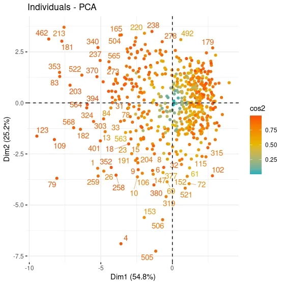
When the contributions of the observations in the PC1 and PC2 graphs are analyzed, a clustering is observed in the upper right and lower right. It can be said that these observations express similar characteristics. For example, when the values of the 79th observation at the bottom left are examined, it can be seen that it has values close to the maximum for all variables except Radius and Texture. When the 569th observation values on the opposite axis are examined, it can be seen that Smoothness and Concavity have minimum values, while Texture has a value above the 3rd quartile.
fviz_pca_var function included in the factoextrapackage, the contribution of each variable in the data set to the components can be visualized.
fviz_pca_var(data.pca, col.var = "contrib", gradient.cols = c("#00AFBB", "#E7B800", "#FC4E07"), repel = TRUE )
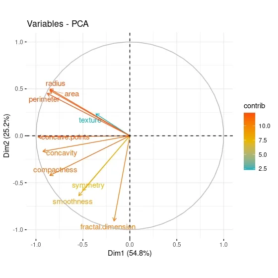
When the PCA graph of the variables is analyzed, it can be said that the variables with positive correlation point to the same regions. While Area has a positive correlation with Perimeter, which is in the same component, it has a negative correlation with fractal dimension, which is in a different component. The contributions of the variables can be better seen through this graph.
So far in this series of posts I have focused more on theoretical background of the unsupervised learning. In the next part or parts I will implement all the algorithms and metrics entirely in R. I will interpret the outputs and try to decide on the best clustering algorithm.
That was the end of this post. Just like always:
"In case I don't see ya, good afternoon, good evening, and good night!"
References
[1] Bryant, F. B., & Yarnold, P. R. (1995). Principal-components analysis and exploratory and confirmatory factor analysis.
[2] James, G., Witten, D., Hastie, T., & Tibshirani, R. (2013). An introduction to statistical learning (Vol. 112, p. 18). New York: springer.
[3] Ben-Hur, Asa, and Isabelle Guyon. Detecting stable clusters using principal component analysis. Functional genomics. Humana press, 159–182, 2003.
[4] Ding, Chris, and Xiaofeng He. K-means clustering via principal component analysis. Proceedings of the twenty-first international conference on Machine learning. 2004.